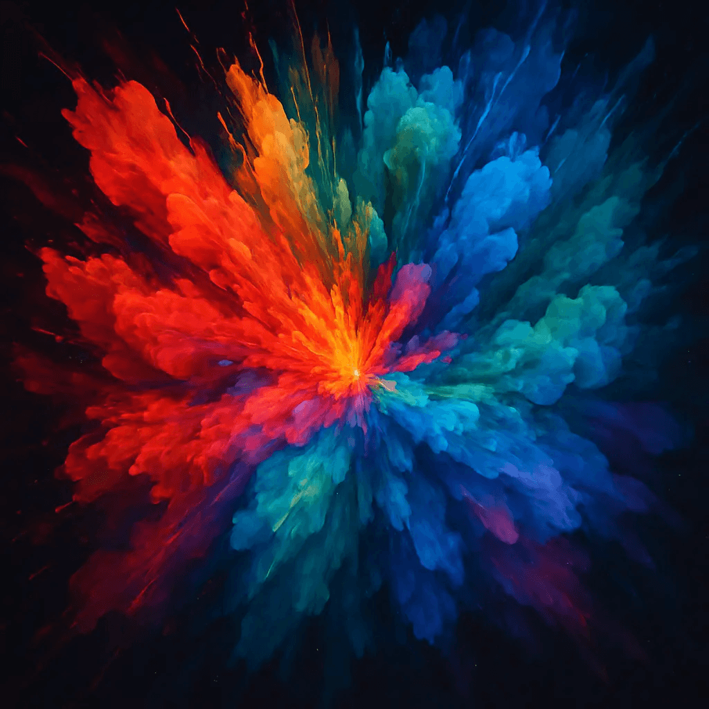
8 Midjourney Color Prompts for Stunning Images in 2026
Author
Promptaa
Date Published
Welcome to your definitive guide on mastering color in Midjourney. While a simple prompt can generate an image, controlling its color palette is the key that separates amateur results from professional, breathtaking visuals. Precise color control allows you to evoke specific emotions, maintain brand consistency, and create images with cinematic depth. But how do you go beyond basic commands like "blue sky"?
This guide explores eight powerful techniques for creating advanced Midjourney color prompts. We will move from simple color names to sophisticated strategies involving mood, lighting, and art history. Each method is broken down with a strategic analysis, tactical prompt examples you can copy directly, and actionable takeaways to replicate the results.
You will learn to command color with intention by exploring:
Specific HEX codes and cinematic color grading.
Mood-based color psychology and art movements.
Advanced lighting, saturation, and color harmony.
Palette extraction from reference images.
By the end of this article, you'll have a complete toolkit to transform your creative vision into stunning, pixel-perfect reality. For creators looking to systematize this process, tools like Promptaa offer a powerful way to store, organize, and share your most effective color prompt formulas, ensuring consistency across every project. Let's dive into the techniques that will give you complete control over your Midjourney creations.
1. Cinematic Color Grading with Specific Color Codes
Controlling color is one of the most effective ways to dictate an image's mood and professionalism. This advanced technique involves directing Midjourney with specific color codes and names, moving beyond general requests like "warm colors" to achieve a precise, cinematic look. By defining a palette with hex codes or exact color names, you gain granular control over the final output, ensuring every image aligns with a specific visual strategy.
This method is fundamental for anyone aiming to create a cohesive set of visuals, such as for a brand campaign, a website mockup, or a stylized social media feed. It bridges the gap between random generation and intentional design, making Midjourney a reliable tool for professional creative work.
Strategic Breakdown
Primary & Accent Colors: Guide the AI by specifying the dominant colors. For instance, a prompt might include "primary color #0A1931, accent color #E94560" to build a scene around a navy blue and bright red-pink combination.
Shadows & Highlights: Go a step further by defining the tones of your shadows and highlights. Adding "deep teal shadows" or "pale yellow highlights" can introduce subtle complexity and depth that mimics professional color grading.
Color Distribution: You can also suggest how much of each color should appear. A phrase like "a palette of 70% dark slate grey, 20% cyber yellow, and 10% white" gives Midjourney clear instructions on visual hierarchy.
When to Use This Technique
This approach is perfect when visual consistency is critical. It's the go-to method for designers and marketers who need to adhere to strict brand guidelines.
Key Insight: Using specific hex codes is not just about color; it's about brand integrity and narrative cohesion. It transforms Midjourney from a creative toy into a powerful branding tool.
For instance, a fashion brand can generate an entire campaign where every image features its signature colors. Likewise, a UX designer can create mockups that precisely match a company's corporate identity. Combining this with specific keywords can produce remarkably realistic and on-brand visuals. To get even closer to photorealism, you can discover prompt keywords to make images less fake-looking and apply them alongside your color palettes. This synergy between color control and realism is where truly professional results are born.
2. Mood-Based Color Psychology Prompting
This technique shifts focus from defining specific colors to describing a desired emotional state. By using words associated with feelings, you guide Midjourney to select color palettes based on established principles of color psychology. Instead of dictating a hex code, you prompt with emotions like "serene," "melancholic," or "energetic," allowing the AI to interpret the mood and generate a visually resonant image.
This method is incredibly powerful for storytelling, content marketing, and any visual that needs to connect with an audience on an emotional level. It grants creative freedom while ensuring the final image evokes a specific feeling, making it perfect for artists, authors, and mental health content creators.
Strategic Breakdown
Emotional Descriptors: Use adjectives that define a feeling. A prompt containing "a peaceful and tranquil landscape" will likely produce soft blues, greens, and pale yellows, while "an anxious and chaotic cityscape" will generate jarring, high-contrast colors like reds and dark grays.
Combine Mood and Setting: Add context to refine the AI's color choice. For example, "a nostalgic summer evening" connects a feeling (nostalgia) with a time of day, suggesting warm, golden, and slightly faded tones reminiscent of old photographs.
Layered Emotions: For more complex results, use multiple emotional keywords. A prompt like "a scene of joyful solitude" might blend the bright colors of joy with the calm, muted tones of solitude, creating a nuanced and thought-provoking image.
When to Use This Technique
This approach is ideal when the primary goal is to evoke a specific emotional response. It works exceptionally well for book covers, therapy-related content, or any project where mood is more important than brand-specific color matching. To effectively use these kinds of Midjourney color prompts, a deeper dive into color psychology can equip you with the knowledge to craft prompts that resonate emotionally.
Key Insight: Prompting with mood outsources the color selection to the AI's vast knowledge of art and culture, often resulting in more creative and emotionally impactful palettes than a human might manually select.
For instance, an author can generate cover art for a thriller by prompting for "a sense of impending dread and paranoia," and Midjourney will pull from a visual library of unsettling greens, deep shadows, and stark, cold blues. This method ensures the visual and narrative themes are perfectly aligned from the first glance.
3. Art Movement and Historical Color Periods
Invoking specific art movements is a powerful shortcut for generating rich, historically authentic color palettes in Midjourney. This technique involves referencing periods like the Renaissance, Impressionism, or Art Deco to tap into the color sensibilities already embedded within the AI model. Instead of building a palette from scratch, you're essentially asking Midjourney to recall the colors and tones associated with entire eras of art history, resulting in sophisticated and period-accurate visuals.
This method is ideal for creating images with a strong sense of time and place. Fashion designers can create throwback collections, while game developers can build entire worlds with a consistent retro aesthetic. It allows creators to produce visuals that feel grounded in a specific cultural or artistic context, adding a layer of authenticity that is difficult to achieve with generic color requests.
Strategic Breakdown
Direct Movement Invocation: The simplest approach is to name the movement directly. A prompt containing "in the style of Baroque painting" or "a 1970s psychedelic poster" immediately tells Midjourney to adopt the associated colors, from the dramatic chiaroscuro of Baroque art to the earthy oranges and browns of the '70s.
Artist-Specific Palettes: For more focused results, reference a specific artist known for their color work. Using "colors by Henri Matisse" will produce images with bold, saturated primary colors, while "Anselm Adams contrast levels" will generate stark, high-contrast black-and-white scenes.
Hybrid Aesthetics: Combine movements to create unique visual styles. Prompts like "Art Deco meets cyberpunk" can produce fascinating fusions, blending the geometric elegance of the 1920s with the neon glow of a futuristic city. This is a great way to generate novel concepts.
When to Use This Technique
This is the perfect strategy when you need to establish a strong historical mood or vintage aesthetic quickly. It's used by art directors, set designers, and brand strategists to craft compelling, era-specific narratives. When exploring the influence of specific art movements on color choices, consider elements like the intriguing Art Deco aesthetic for inspiration.
Key Insight: Referencing an art movement is more than a style instruction; it’s a comprehensive color brief. You are giving Midjourney a complete cultural and historical context, which includes typical palettes, lighting, and texture.
For example, a marketing agency can generate product photography that feels authentically vintage without a complex photoshoot. Similarly, an educator could create visuals that accurately represent different periods in art history. To push this further, exploring a full range of Midjourney art styles can give you an even larger vocabulary to work with, allowing for more precise and creative combinations.
4. Gradient and Color Transition Prompting
Directing color flow with gradients is a powerful method to add depth, modernity, and visual interest to your Midjourney creations. This technique involves specifying how colors should blend and shift across the canvas, allowing you to create everything from subtle atmospheric effects to bold, graphic backgrounds. Instead of letting the AI guess where colors should go, you provide clear instructions on their transition and distribution.
This method is especially useful for web designers, social media managers, and graphic artists who rely on gradients for brand identity and visual hierarchy. By mastering gradient prompting, you can produce polished assets like website hero sections, app interfaces, and branded content directly within Midjourney, saving significant time in post-processing.
Strategic Breakdown
Directional Gradients: Give the AI a sense of direction for the color flow. You can use simple terms or get creative. For instance, a prompt could include "a diagonal gradient from top-left to bottom-right, transitioning from #FFD700 to #FF6347" for precise control.
Clock-Based Transitions: For more intuitive directional control, use clock positions. A prompt like "gradient flowing from 12 o'clock (deep blue) to 6 o'clock (light purple)" gives Midjourney a clear spatial map for the color blend.
Opacity and Blending: Combine gradients with transparency to create overlays or subtle effects. Adding "semi-transparent color overlay with a vertical gradient" can produce a sophisticated finish without overpowering the image's main subject.
When to Use This Technique
This approach is ideal for creating modern, clean designs and backgrounds where color flow is a key element. It is the go-to method for UI/UX designers building mockups and marketers creating on-brand social media graphics that need to capture attention quickly.
Key Insight: Specifying gradient flow is not just a stylistic choice; it's a way to guide the viewer's eye and establish a visual mood. It gives you control over the image's energy and structure.
For example, a tech startup could generate a series of website backgrounds all featuring its signature blue-to-green gradient, ensuring brand consistency. Similarly, a content creator could design poster art using dramatic, multi-color gradients to convey a specific theme. When you need smooth, intentional color transitions, these specific Midjourney color prompts provide an effective and direct solution.
5. Lighting and Color Temperature Control
Instead of directly telling Midjourney which colors to use, you can guide its color choices indirectly by describing the light. This technique involves specifying lighting conditions, color temperature, and time of day to influence the overall color palette. By prompting for "golden hour light" or "cool morning mist," you can achieve natural and evocative color harmonies without explicitly naming a single hue.
This method gives your images an authentic, atmospheric quality because the colors are intrinsically tied to a realistic light source. It's an excellent way to add mood, depth, and realism, making the final image feel less like a random generation and more like a captured moment.
Strategic Breakdown
Time of Day: Use keywords like "golden hour," "blue hour," "midday sun," or "dusk" to create distinct color temperatures. "Golden hour" will produce warm yellows, oranges, and soft shadows, while "blue hour" will generate deep blues and purples.
Light Quality & Direction: Specify the nature of the light. "Soft diffused light" creates even tones and low contrast, ideal for portraits. In contrast, "harsh directional backlighting" can produce dramatic silhouettes and bright rim lights.
Artificial & Atmospheric Light: Introduce specific light sources like "neon signs," "candlelight," or "tungsten lamp" to cast their unique colors onto the scene. You can also add atmospheric conditions such as "foggy morning" or "hazy afternoon" to desaturate colors and soften the light.
When to Use This Technique
This approach is best when your goal is realism and emotional depth. It's a favorite for artists creating cinematic scenes, environmental concepts, or realistic photography styles where the mood is defined by the environment's light.
Key Insight: Controlling the light source is a proxy for controlling the entire color palette. It’s a more organic method for creating cohesive and emotionally resonant Midjourney color prompts.
For example, a real estate photographer can generate images of a property with authentic "warm afternoon sunlight" to make it feel more inviting. Similarly, a food photographer can use "soft, warm studio lighting" to make dishes appear more appetizing. By mastering light, you gain an intuitive and powerful command over color. For a deeper look at this, you can explore specialized Midjourney lighting prompts to refine your results even further.
6. Saturation and Vibrancy Control Prompting
Controlling color saturation is a powerful way to define an image’s emotional tone, separate from its specific color palette. This focused technique lets you command Midjourney to generate images with specific saturation levels, ranging from completely desaturated black and white to hyper-saturated, vivid visuals. Instead of just picking colors, you’re directing the intensity of those colors.
This method is essential for establishing a consistent mood across different subjects and compositions. It allows artists and designers to apply a specific aesthetic, like the muted tones of an indie film or the trendy pastels of a modern brand, without being locked into an exact set of colors every time.
Strategic Breakdown
Define Saturation Levels: Use direct keywords to guide the AI. Phrases like "desaturated," "low saturation," "muted tones," "high vibrancy," or "hyper-saturated" give Midjourney clear instructions on the overall color intensity.
Link to Eras and Styles: Connect saturation to specific cultural or artistic references for more nuanced results. Prompts such as "desaturated 1970s film stock" or "vibrant 1980s neon aesthetic" combine color intensity with a recognizable style.
Selective Saturation: Create a strong focal point by contrasting saturation levels. For instance, prompting for a "richly saturated subject with a muted, desaturated background" instantly draws the viewer’s eye and adds professional depth.
When to Use This Technique
This approach is ideal when the mood and artistic style are more important than specific brand colors. It’s perfect for creating atmospheric photography, minimalist designs, or any visual that relies on a distinct emotional feel.
Key Insight: Directing saturation gives you control over the image’s energy. Low saturation can feel calm, nostalgic, or serious, while high saturation conveys excitement, energy, and intensity.
For example, a wellness brand could use "muted sage green, desaturated blue-grey" to generate a series of calming, organic visuals. Conversely, a music festival could use "vibrant" and "highly saturated" in its midjourney color prompts to create dynamic and energetic promotional material. This technique provides a reliable way to manage an image’s emotional impact.
7. Color Harmony and Complementary Palette Prompting
Moving beyond individual colors, this sophisticated technique applies established color theory principles directly within your Midjourney prompts. Instead of listing colors one by one, you guide the AI using terms like "complementary," "analogous," or "triadic" color schemes. This approach prompts Midjourney to generate images with built-in visual harmony, creating compositions that feel naturally balanced and professionally designed.
This method is exceptionally powerful for creating visuals that need to be aesthetically pleasing without requiring you to manually select a full palette. It taps into the AI's understanding of art and design principles, yielding results that are both striking and cohesive, making it a favorite among designers and artists.
Strategic Breakdown
Name the Harmony: Explicitly state the color relationship you want. For example, use prompts like "a triadic color harmony" for dynamic, high-contrast scenes or "an analogous color scheme of blues and greens" for serene, unified visuals.
Specify a Base Color: To gain more control, anchor the harmony to a specific color. A prompt like "complementary color palette based on orange" tells Midjourney to find its natural opposite (blue) and build the image around that pair.
Control Saturation and Value: Combine color theory with modifiers for tone. Adding terms like "muted analogous colors" or "vibrant triadic palette" fine-tunes the mood, shifting the image from subtle and soft to bold and energetic.
When to Use This Technique
This is the ideal approach when the goal is a visually pleasing composition grounded in traditional design principles, but you don't have a strict brand palette to follow. It's perfect for fine art concepts, interior design mockups, and illustrative work where emotional impact and balance are key.
Key Insight: Prompting with color theory is like collaborating with a designer who has an innate sense of balance. You provide the strategic direction ("complementary"), and the AI handles the tactical execution of choosing the perfect shades.
For example, a UI designer could quickly generate concepts for a new app using "UI design with a split-complementary color scheme" to explore engaging, user-friendly palettes. Similarly, an artist can create a series of works by exploring different harmonies, ensuring the collection feels connected yet diverse. These Midjourney color prompts give you access to time-tested visual rules without needing to be a color theory expert yourself.
8. Palette Extraction and Reference-Based Color Prompting
This practical technique involves deconstructing the color schemes of existing visuals-like competitor websites, viral social media posts, or even classical art-and applying them to your Midjourney prompts. Instead of inventing a palette from scratch, you analyze what already works and translate that successful color DNA into your own creations. It’s a reverse-engineering approach that ensures your images align with established visual standards or industry trends.
By extracting colors from reference images, you build on proven aesthetic formulas. This method is especially useful for commercial projects where fitting into a specific market or visual conversation is crucial. It’s a reliable way to produce Midjourney color prompts that are both creative and context-aware, grounding your work in real-world success.
Strategic Breakdown
Analyze and Extract: Use a color picker tool to identify the 3-5 most dominant colors from a reference image. Focus on the primary, secondary, and key accent tones that define its overall mood.
Translate to Prompt Language: Convert the extracted colors into clear prompt instructions. You can use their hex codes (e.g., #A4B494, #D4C4B4) or descriptive names (e.g., "sage green," "muted beige") to guide the AI.
Combine with Context: Pair your extracted palette with descriptive keywords about style, subject, and composition. A prompt might look like: "e-commerce product photography, skincare bottle, minimalist, clean background, color palette of soft clay, pale olive, and off-white."
When to Use This Technique
This method is invaluable for brand strategists, UX/UI designers, and marketers who need to generate visuals that feel current and competitive. It is also perfect for artists and designers looking to recreate a historical aesthetic or emulate a specific creative style with accuracy.
Key Insight: Palette extraction isn't about copying; it's about learning from what resonates with an audience. By adopting color schemes from successful examples, you embed a proven psychological and aesthetic appeal directly into your prompts.
For example, an e-commerce brand can analyze a top competitor’s website to create product mockups that feel familiar yet distinct. A content creator can study trending color palettes on Instagram to ensure their visuals capture the current zeitgeist. This strategic use of reference-based Midjourney color prompts makes your creative process more efficient and market-aware, increasing the likelihood of producing relevant and engaging images.
8-Point Comparison of MidJourney Color Prompt Techniques
| Technique | Implementation Complexity 🔄 | Resource Requirements ⚡ | Expected Outcomes ⭐ / 📊 | Ideal Use Cases 💡 | Practical Tips 💡 |
|---|---|---|---|---|---|
| Cinematic Color Grading with Specific Color Codes | High — precise hex and theory required 🔄 | Medium — palette tools, style guides, testing ⚡ | Very consistent, professional cinematic look ⭐ 📊 | Brand campaigns, fashion, batch image generation 💡 | Use Adobe Color/Coolors; include names with hex; document formulas |
| Mood-Based Color Psychology Prompting | Low–Medium — conceptual descriptors, less technical 🔄 | Low — mood vocab and examples suffice ⚡ | Emotionally resonant but less predictable ⭐ 📊 | Storytelling, book covers, wellness, emotional marketing 💡 | Combine mood with time-of-day and art style; layer descriptors |
| Art Movement and Historical Color Periods | Medium — requires art-history familiarity 🔄 | Medium — reference images and era research ⚡ | Historically authentic, stylistically coherent outcomes ⭐ 📊 | Retro fashion, game art, educational visuals, period pieces 💡 | Specify decade/artist and medium; mix movements carefully; note cultural sensitivity |
| Gradient and Color Transition Prompting | High — technical gradient mechanics and directions 🔄 | Medium — testing templates and iterations ⚡ | Polished depth and visual flow; can be unpredictable if complex ⭐ 📊 | Web hero backgrounds, UI overlays, posters, social graphics 💡 | Use clock/percentage directions; start with 2-color tests; document formulas |
| Lighting and Color Temperature Control | Medium — requires lighting terminology knowledge 🔄 | Low–Medium — lighting references, Kelvin values ⚡ | Realistic photographic palettes and immersive mood ⭐ 📊 | Product photography, film posters, real estate, food imagery 💡 | Combine time-of-day + location; specify light quality and direction |
| Saturation and Vibrancy Control Prompting | Low — straightforward saturation descriptors 🔄 | Low — minimal tools, iterative testing ⚡ | Consistent tone across content; risk of artificiality if overused ⭐ 📊 | Minimalist branding, indie films, social media aesthetics 💡 | Use selective saturation for emphasis; pair with era refs; build a saturation spectrum |
| Color Harmony and Complementary Palette Prompting | Medium — needs color theory understanding 🔄 | Low–Medium — wheel references or apps ⚡ | Balanced, cohesive visuals grounded in theory ⭐ 📊 | Brand identity, interiors, UI/UX, fine art systems 💡 | Reference harmony type (triadic, complementary); combine with saturation notes |
| Palette Extraction and Reference-Based Color Prompting | Medium–High — analysis and translation required 🔄 | High — extraction tools, source libraries, time ⚡ | Brand-aligned, data-driven, reproducible palettes ⭐ 📊 | Rebranding, competitor benchmarking, historical recreation 💡 | Extract 3–5 dominant colors; use multiple refs; document sources and prompts |
Your Next Steps to Midjourney Color Dominance
You now possess a structured framework for commanding color in your AI-generated art. We've journeyed through eight distinct, repeatable strategies, leaving behind random chance for a more deliberate and powerful creative process. The core lesson is clear: intentionality is the foundation of impactful art. The most memorable images are not accidents; they are the result of a clear vision executed with precise tools. The collection of Midjourney color prompts we've explored provides exactly that-a tactical toolkit to bring your specific color ideas to life.
This guide moved beyond simple color names, giving you a professional-grade methodology. We started with the exactitude of hex codes for cinematic grading, ensuring your brand or project colors are perfectly represented. Then, we explored the emotional depth of mood-based prompting, using psychology to make your audience feel a certain way. By digging into art history and specific movements, you learned how to borrow established, time-tested palettes to add a layer of cultural resonance to your work.
Your ability to create art is no longer limited by what Midjourney guesses you want. You are now equipped to be the director of your digital canvas.
Your Action Plan for Color Mastery
Knowledge without action is just trivia. To truly internalize these concepts and make them a part of your creative workflow, you need to start experimenting methodically. Here is a simple, actionable plan to begin your journey toward color dominance:
Isolate and Master One Technique: Don't try to do everything at once. Choose a single strategy from the article that resonates with you. For instance, dedicate your next session purely to mastering Lighting and Color Temperature. Test keywords like golden hour lighting, cool fluorescent light, or dramatic volumetric lighting and observe the subtle and significant shifts in the mood and palette.
Build Your "Success Formula" Library: As you experiment, you will discover specific phrases and parameter combinations that produce consistently excellent results. Start documenting them. Keep a simple text file or notebook where you save your most successful Midjourney color prompts. Note the prompt, the --style or --ar values used, and a brief description of the outcome. This personal library is your greatest asset.
Analyze and Iterate: When a generation doesn't work, don't just discard it. Analyze why it failed. Did the prompt for a "serene pastel palette" get overpowered by a subject keyword like "volcanic eruption"? Understanding these conflicts is as important as knowing what works. This diagnostic skill will rapidly accelerate your learning curve.
The ultimate goal is to move from a reactive creator, hoping for a good result, to a proactive director who can dictate the final image with confidence and consistency. A deep understanding of color is a timeless artistic skill, and by applying these structured prompting techniques, you are building an expertise that will remain valuable no matter how AI tools change.
Ready to stop losing your best prompts and build a powerful, organized creative system? Promptaa is designed for exactly this purpose. Save, categorize, and refine your winning Midjourney color prompts in a central library, turning your one-off successes into a reliable, scalable asset for all your future projects. Start building your professional prompt library today at Promptaa.