8 Incredible Styles for Your Next Midjourney Appicpn Prompt in 2026
Author
Promptaa
Date Published
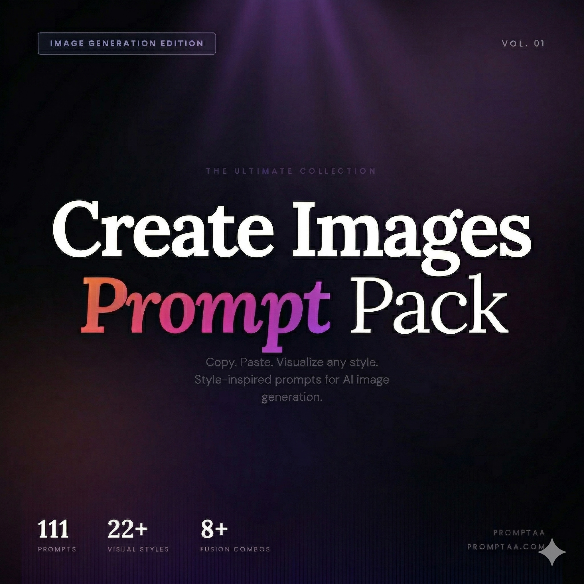
Creative Images Prompt Pack Vol. 1
Create images like Ghibli Studios, Film Noir, Fantasy Concept Art & 22+ more styles. 111+ ready-to-paste prompts for any AI image generator like Midjourney or Gemini.
Designing a memorable app icon is one of the most critical steps in launching a new digital product. An icon serves as the primary visual touchpoint for your brand, a small but mighty piece of real estate on a user's screen that needs to be both attractive and instantly recognizable. Crafting the perfect design often requires countless iterations, a deep understanding of branding, and significant design resources. This is where mastering the right Midjourney app icon prompt can give you a powerful advantage, allowing you to generate dozens of high-quality concepts in minutes.
This guide provides a curated collection of effective prompts specifically engineered for creating stunning app icons with Midjourney. We will move beyond basic descriptions and dive into the specific structures, parameters, and keywords that produce professional results. For each example, we'll break down the prompt, analyze why it works, and provide actionable takeaways you can apply to your own projects. You'll learn how to control styles from minimalist geometric designs to vibrant character mascots and refine your outputs using parameters like --ar, --stylize, and version-specific commands.
By understanding these techniques, you can rapidly prototype ideas, explore different aesthetic directions, and create a solid foundation for your final icon. As you get more comfortable with prompt-based creation, you may want to explore how specialized AI-native tools that turn prompts into production are further changing the design workflow from initial concept to finished asset. This article will equip you with the foundational skills to start that journey, turning simple text commands into compelling visual identities for any application. Get ready to explore eight distinct styles and the prompts that bring them to life.
1. Minimalist Geometric App Icon with Gradient
Minimalist geometric designs with smooth gradients are an excellent starting point for a high-quality app icon. This style combines clean, simple shapes with vibrant color transitions, creating a modern and professional look. It's especially effective for apps that need to convey clarity, efficiency, and a touch of elegance, such as productivity tools, financial apps, or creative software.
The core of this approach is simplicity. By focusing on basic geometric forms like circles, squares, or abstracted letters, you create an icon that is easily recognizable even at small sizes. The gradient adds depth and visual interest without cluttering the design. This makes the minimalist geometric style a reliable midjourney appicpn prompt technique for achieving a polished result quickly.
Prompt Breakdown and Analysis
A successful prompt for this style needs to clearly define the geometry, the color palette, and the visual treatment.
Base Prompt Example: app icon for a productivity app, minimalist, geometric logo, letter 'P' made of abstract shapes, clean vector design, vibrant blue and green gradient, on a white background --ar 1:1 --v 6.0 --s 250
Analysis:
Subject: app icon for a productivity app clearly sets the context.
Core Style: minimalist, geometric logo, clean vector design guides Midjourney toward a sharp, uncluttered aesthetic.
Key Element: letter 'P' made of abstract shapes provides a specific, recognizable form for the AI to build upon.
Color & Finish: vibrant blue and green gradient defines the color scheme and adds that modern flair.
Background: on a white background ensures the icon stands out and is easy to isolate.
Strategic Insight: Specifying a letter and instructing Midjourney to construct it from "abstract shapes" gives you a balance of control and creative freedom. The AI interprets the form while adding its own geometric twist, often leading to more unique outcomes than just prompting for a "letter P logo."
Actionable Tips for Customization
To refine this style for your own needs, experiment with the following elements:
Vary the Geometry: Instead of a letter, try interlocking circles, a single folded ribbon, or a stylized mountain peak.
Adjust the Gradient: Test different color combinations. For a more subtle look, use an analogous color gradient (e.g., blue to light blue). For high energy, try a contrasting color gradient (e.g., orange to purple).
Introduce Texture: Add terms like subtle grain texture or faint paper texture to give the flat design a more tactile feel.
Refine with Parameters:
--stylize (--s): A lower value (e.g., --s 100) often produces results closer to your prompt's core elements, while a higher value (e.g., --s 500) allows for more artistic interpretation.
--chaos (--c): A low chaos value (e.g., --c 10) will keep the variations in your image grid more consistent and focused on the central theme.
2. Isometric 3D Icon Design
Isometric 3D designs give app icons a sense of depth and physicality, making them feel more tangible and engaging. This style uses a 2.5D perspective to create a three-dimensional object on a two-dimensional plane without converging perspective lines. It’s a popular choice for SaaS platforms, productivity tools, and any app that wants to visually represent a process or a system, like the well-known icons for Dropbox or GitHub.
The structured, clean look of isometric art is perfect for conveying organization, complexity, and modern design principles. Unlike flat designs, these icons pop off the screen, grabbing user attention and suggesting a premium, well-built product. For anyone looking to generate a professional-looking icon, an isometric midjourney appicpn prompt is a powerful technique for achieving a polished, contemporary aesthetic.
Prompt Breakdown and Analysis
A great isometric prompt must define the object, the materials, the lighting, and the overall perspective clearly.
Base Prompt Example: app icon, a floating isometric cube made of translucent glass, glowing neon core, dark mode, cinematic lighting, octane render, 3D icon, product design --ar 1:1 --v 6.0 --s 300
Analysis:
Subject: app icon, a floating isometric cube establishes the core form and perspective.
Core Style: 3D icon, octane render, product design directs Midjourney to create a high-fidelity, polished 3D object.
Key Element: made of translucent glass, glowing neon core adds specific materials and internal details that create visual interest.
Color & Finish: dark mode, cinematic lighting sets a professional, high-contrast mood and defines the light source.
Background: The combination of dark mode and floating implies a clean, dark background to make the icon stand out.
Strategic Insight: Using render engine terms like octane render or unreal engine is a key trick. It tells Midjourney to aim for the photorealistic quality and lighting models associated with professional 3D software, resulting in a more premium and detailed output.
Actionable Tips for Customization
To tailor this 3D style to your specific brand or concept, adjust these prompt elements:
Change the Object: Swap cube for stack of papers, a stylized server rack, or a shield to better represent your app's function.
Experiment with Materials: Try keywords like clay model, smooth plastic, brushed metal, or soft touch silicone to alter the texture and feel of the icon.
Control the Lighting: Use soft studio lighting for a clean, even look, or dramatic side lighting to create strong shadows and highlights. Cinematic lighting often produces a more dynamic result.
Refine with Parameters:
--style raw: Using this parameter with a lower stylize value can give you a more photographic and less "opinionated" interpretation of your 3D object.
--stylize (--s): A value between --s 250 and --s 500 works well here, balancing prompt adherence with artistic polish.
3. Abstract Glyph Icon with Negative Space
Using abstract glyphs and negative space is a clever way to create a memorable and meaningful app icon. This style relies on the empty space within or around a shape to form a secondary image or idea, adding a layer of depth and intelligence to the design. It's particularly well-suited for tech-forward applications, like AI tools or data analytics platforms, where the design needs to communicate complexity and innovation in a simple, visual form.
This method transforms a basic shape into a compelling visual puzzle. The viewer’s mind fills in the gaps, making the icon more engaging and memorable. For anyone developing a midjourney appicpn prompt, mastering negative space is a powerful technique for producing icons that feel professional, intentional, and conceptually rich.
Prompt Breakdown and Analysis
A great prompt for this style must clearly define both the primary shape and the concept you want to embed within its negative space. The key is to guide Midjourney to see the relationship between the two elements.
Base Prompt Example: app icon, a single bold letter 'P' logo, a speech bubble is formed in the negative space inside the P, modern tech logo, minimalist, vector, 2d flat, dark blue on a white background --ar 1:1 --v 6.0 --s 300
Analysis:
Subject: app icon, a single bold letter 'P' logo establishes the primary, dominant shape.
Core Style: modern tech logo, minimalist, vector, 2d flat directs the AI toward a clean, sharp aesthetic suitable for a tech brand.
Key Element: a speech bubble is formed in the negative space inside the P is the most crucial part. It explicitly tells Midjourney how to use the empty area creatively.
Color & Finish: dark blue on a white background provides a simple, high-contrast color scheme that helps the negative space stand out.
Strategic Insight: The phrase "formed in the negative space" is the secret sauce. Simply listing two elements (e.g., "letter P, speech bubble") might result in them being placed side-by-side. Specifying the negative space relationship forces Midjourney to integrate them conceptually, leading to a much smarter design.
Actionable Tips for Customization
To adapt this style for your own icon concepts, consider these adjustments:
Explore Different Concepts: Try combining a flame icon with a human head silhouette in the negative space, or a book icon with a keyhole in the negative space.
Use a Limited Palette: Stick to one or two colors to maximize the impact of the negative space. Try prompts with monochromatic or duotone color scheme.
Balance the Visuals: If the AI's output feels unbalanced, add terms like symmetrical or centered logo to guide the composition. Sometimes, defining the background and foreground colors is not enough; you might need to use a negative prompt to exclude certain elements. For more on this, check out our guide on what a negative prompt is in AI.
Refine with Parameters:
--stylize (--s): A moderate value like --s 300 works well here. Too low, and the AI may struggle to form the negative space element. Too high, and it might over-complicate the simple glyph.
--style raw: Using --style raw can sometimes produce more literal and less "artistic" interpretations, which can be helpful for achieving a precise geometric or logo-style result.
4. Vibrant Colorful Illustration Icon
Moving beyond simple geometry, a vibrant, illustrative style can give an app a huge dose of personality. This approach uses detailed, colorful illustrations to create a playful and approachable feel, making it perfect for creative tools, educational apps, or any brand that wants to connect with its users on a more personal level. Think of the friendly characters and dynamic scenes seen in apps like Duolingo or the expressive icons in Figma and Canva.
This style is fantastic for building a memorable brand identity. Instead of relying on abstract shapes, it tells a small story or presents a charming character, making the icon instantly engaging. Crafting an effective midjourney appicpn prompt for this style involves describing a scene or a character with enough detail to guide the AI while leaving room for its artistic interpretation to shine through, resulting in a unique and professional-quality illustration.
Prompt Breakdown and Analysis
A strong prompt for an illustrative icon needs to define the subject, the artistic style, and the overall mood.
Base Prompt Example: app icon, a cute friendly robot character holding a paintbrush, digital art illustration, vibrant and playful colors, simple shapes, for a creative design app, on an isolated light grey background --ar 1:1 --v 6.0 --s 300
Analysis:
Subject: a cute friendly robot character holding a paintbrush gives Midjourney a clear and compelling character concept.
Core Style: digital art illustration, simple shapes specifies the medium and guides the AI towards a clean, modern illustrative look rather than a photorealistic one.
Color & Mood: vibrant and playful colors sets the emotional tone and desired color palette.
Context: for a creative design app helps the AI understand the icon's purpose.
Background: on an isolated light grey background provides a neutral canvas that makes the colorful illustration pop.
Strategic Insight: The key to this style is balancing detail and simplicity. The prompt asks for an "illustration" but tempers it with "simple shapes." This prevents Midjourney from creating an overly complex image that would be illegible at small icon sizes.
Actionable Tips for Customization
To tailor this illustrative style for your specific app, consider these adjustments:
Change the Character: Swap the robot for a wise owl wearing glasses for an educational app, or a minimalist fox sitting on a crescent moon for a sleep or wellness app.
Modify the Art Style: Experiment with terms like flat 2D illustration, isometric 3D icon, claymation style, or doodle sketch style to get completely different visual textures.
Refine the Color Palette: Be more specific with colors. Try a palette of pastel pinks, blues, and yellows for a softer feel, or bold primary colors for a high-energy, kid-friendly look.
Adjust Parameters for Detail:
--stylize (--s): A higher value like --s 400 can encourage Midjourney to generate more imaginative and artistic characters. A lower value like --s 150 will stick more closely to your descriptive prompt.
--style raw: Using this parameter with a lower stylize value can sometimes produce a more direct and less "opinionated" interpretation of your prompt, giving you a purer illustrative feel.
5. Glassmorphism Icon with Frosted Effect
Glassmorphism is a popular design trend that mimics the look of frosted glass, creating a sense of depth and translucency. This style uses blurred backgrounds, soft shadows, and semi-transparent layers to achieve a modern, airy feel. It is an excellent choice for apps in the tech, finance, or AI space, as it suggests transparency and a forward-thinking aesthetic, aligning with design systems seen in iOS and Windows 11.
The key to this look is the frosted, see-through surface that appears to float above a colorful background. This effect adds dimension without introducing visual clutter, making the icon feel light and interactive. Crafting a strong midjourney appicpn prompt for glassmorphism requires careful layering of descriptive terms to capture both the transparency and the texture of the frosted effect.
Prompt Breakdown and Analysis
A successful glassmorphism prompt must define the central object, the glass effect, and the background that will be visible through it.
Base Prompt Example: app icon, a stylized 'W' crypto wallet logo, glassmorphism style, frosted glass effect, translucent, vibrant purple and orange aurora background, soft lighting, 3D icon --ar 1:1 --v 6.0 --s 300
Analysis:
Subject: app icon, a stylized 'W' crypto wallet logo sets a clear purpose and central element.
Core Style: glassmorphism style, frosted glass effect, translucent are the crucial keywords. Explicitly stating "glassmorphism" and "frosted glass" gives Midjourney precise instructions for the material properties.
Key Element: vibrant purple and orange aurora background is vital. The glass effect is only visible if there is a distinct, colorful background to blur and distort.
Color & Finish: soft lighting, 3D icon enhances the dimensionality, making the glass object feel like it's physically present and catching light.
Strategic Insight: The background is as important as the foreground object. Without a detailed, colorful background prompt, the "frosted glass" has nothing to blur, and the effect will be lost. Use terms like aurora, holographic, or vibrant gradient for the background to get the best results.
Actionable Tips for Customization
To tailor the glassmorphism style, focus on adjusting the material properties and lighting:
Modify Transparency: Add 70% opacity or highly translucent to your prompt to control how see-through the object is. Less opacity makes the background more visible.
Refine the Edges: Try adding soft rounded edges or thin glowing edge to define the shape of the glass object and make it pop against the background.
Experiment with Backgrounds: Swap aurora background for abstract blurred shapes, colorful liquid smoke, or geometric pattern to completely change the icon's mood.
Adjust with Parameters:
--style raw: Using this parameter can sometimes produce a more photorealistic and less "artsy" interpretation of glass, which can be useful for this style.
--stylize (--s): A mid-range value like --s 250-400 works well. Too low, and the glass effect might be weak; too high, and the AI might over-design the icon, losing the clean aesthetic.
6. Character-Based Mascot Icon
A character-based mascot gives an app a friendly face, making it more approachable and memorable. This approach personifies the brand, creating an emotional connection with users by giving them a personality to associate with the software. It’s highly effective for educational apps, community platforms, or any service that benefits from a warm, guiding presence, such as Duolingo's famous owl or Mailchimp's chimp.
Using a character helps humanize technology and can make complex features feel less intimidating. For a midjourney appicpn prompt, the goal is to define the mascot's appearance, personality, and context clearly. This transforms a functional tool into a brand companion, building loyalty and making the user experience more engaging and delightful.
Prompt Breakdown and Analysis
Crafting a mascot requires a prompt that balances character description with stylistic direction to ensure the final icon is both charming and clean.
Base Prompt Example: app icon, a friendly robot mascot for a learning app, cute and simple character design, holding a glowing book, Pixar style 3D render, smooth lighting, on an isolated blue background --ar 1:1 --v 6.0 --s 300
Analysis:
Subject: app icon, a friendly robot mascot for a learning app establishes the core purpose and personality.
Core Style: cute and simple character design, Pixar style 3D render guides the aesthetic toward a polished, modern, and universally appealing look.
Key Element: holding a glowing book visually connects the character to the app's educational function.
Color & Finish: smooth lighting adds depth and a professional finish to the 3D model.
Background: on an isolated blue background provides a clean, high-contrast setting suitable for an app icon.
Strategic Insight: The key to a great mascot prompt is defining its action. Stating the character is holding a glowing book or waving cheerfully tells a micro-story, instantly conveying the app’s purpose and the mascot’s friendly nature. This is much more effective than just describing a static character.
Actionable Tips for Customization
To create a unique mascot that perfectly represents your app, try modifying these elements:
Change the Character: Swap robot for wise owl, clever fox, helpful alien, or even an anthropomorphic lightbulb.
Define the Style: Experiment with different art styles like flat vector illustration, Japanese kawaii style, claymation character, or felt texture model.
Adjust the Pose and Prop: Instead of a book, have the mascot holding a magnifying glass, pointing at a chat bubble, or wearing headphones. The prop should symbolize the app's main function.
Refine with Parameters:
--style raw: Use this with --v 6.0 to reduce Midjourney's default aesthetic and get a result that more literally follows your stylistic keywords (like flat vector).
--stylize (--s): A lower value (--s 150) will keep the character design simpler and closer to your prompt, while a higher value (--s 400) can introduce more intricate details and personality.
7. Gradient Dynamic Icon with Motion Suggestion
Icons that suggest motion and dynamism through flowing gradients and directional forms can make an app feel alive and responsive. This style is perfect for conveying processes, data flow, transformation, or AI-powered actions. It’s an effective choice for fintech apps visualizing transactions, cloud services showing data sync, or any tool that needs to communicate activity and innovation.
The key to this style is creating a sense of movement without relying on actual animation. By using carefully directed gradients and shapes that lead the eye, you can imply action and energy. This makes the icon feel modern and engaging, turning a static image into a visual story of what the app does. As a midjourney appicpn prompt strategy, it produces icons that are both beautiful and conceptually strong.
Prompt Breakdown and Analysis
A great prompt for a dynamic icon must define the motion, the form, and the gradient's flow.
Base Prompt Example: app icon, a dynamic swirling shape suggesting data flow, vibrant purple to teal gradient, circular motion, smooth 3D render, on an isolated dark background --ar 1:1 --v 6.0 --s 300
Analysis:
Subject: app icon sets the basic format and purpose.
Core Style: dynamic swirling shape, smooth 3D render instructs Midjourney to create a fluid, polished object.
Key Element: suggesting data flow, circular motion provides the conceptual direction, guiding the AI to generate forms that imply movement.
Color & Finish: vibrant purple to teal gradient establishes a modern, energetic color palette.
Background: on an isolated dark background makes the vibrant gradient pop and ensures the icon is the sole focus.
Strategic Insight: Using action-oriented words like swirling, flowing, streaking, or spinning is critical. These terms directly tell Midjourney to build movement into the icon’s structure, resulting in a more energetic and less static design.
Actionable Tips for Customization
To adapt this dynamic style for your specific needs, consider these adjustments:
Define the Motion: Be specific about the direction. Try diagonal upward streak, concentric ripples, or a shape folding in on itself. To inspire your dynamic designs and motion suggestions for icons, explore various animated logo examples for ideas on how movement can be represented visually.
Vary the Form: Instead of an abstract swirl, prompt for a stylized 'S' with motion trails or a comet-like shape.
Adjust the Gradient: Experiment with the number of colors. A two-color gradient is clean and focused, while a three-color gradient can add more complexity and depth.
Refine with Parameters:
--style raw: Using this parameter with --v 6.0 can sometimes produce more photographic and less "opinionated" results, which is useful for achieving a specific 3D render look.
--stylize (--s): A moderate value like --s 300 balances your prompt's instructions with Midjourney's artistic flair, perfect for this creative style. You can discover more ways to combine artistic direction with AI generation by exploring other types of drawing prompts.
8. Monochromatic Minimalist with Brand Color Accent
The monochromatic approach, punctuated by a single bold accent color, is a mark of sophisticated and confident design. This style uses shades of black, white, and gray to build a clean, professional foundation, then introduces a specific brand color for strategic emphasis. It's highly effective for enterprise software, financial tools, and any app that needs to project authority, clarity, and trust.
This technique is powerful because of its restraint. The limited palette forces a focus on form, spacing, and the core symbol, resulting in an icon that is instantly readable and feels intentional. The single splash of color draws the eye, highlights a key element, and builds strong brand association without overwhelming the user. For anyone seeking a top-tier midjourney appicpn prompt, mastering this style delivers a timeless and professional asset.
Prompt Breakdown and Analysis
A great prompt for this style must define the monochromatic base, the specific accent color, and the symbolic form.
Base Prompt Example: app icon, a stylized compass, minimalist line art, vector logo, monochrome dark gray and light gray, with a single accent of #00A6FF blue, on a plain white background --ar 1:1 --v 6.0 --s 150
Analysis:
Subject: app icon, a stylized compass establishes a clear and universally understood symbol for guidance or navigation.
Core Style: minimalist line art, vector logo directs Midjourney to create a clean, sharp, and modern design with consistent stroke weight.
Color & Finish: monochrome dark gray and light gray, with a single accent of #00A6FF blue is a precise command. Using a hex code gives you exact control over the brand color.
Background: on a plain white background isolates the icon for maximum clarity and easy post-production use.
Strategic Insight: Specifying the accent color with a hex code (e.g., #00A6FF) is a critical tactic. It removes color ambiguity and ensures Midjourney generates the exact brand hue you need, making the output far more useful for professional projects.
Actionable Tips for Customization
To tailor this style for different applications, consider adjusting these key components:
Change the Symbol: Swap stylized compass for concepts like abstract network nodes, a simple shield outline, or an elegant key shape to match the app's function.
Modify the Base Palette: Instead of gray, try monochrome off-white and charcoal for a softer feel or black and white for maximum contrast.
Experiment with Accent Placement: Add phrases like accent color on the north pointer only or accent color highlighting one line to guide where the color appears.
Refine with Parameters:
--stylize (--s): Keep the stylize value lower (e.g., --s 100 to --s 250) to maintain the minimalist feel and prevent the AI from adding too many distracting elements.
--style raw: Using the --style raw parameter can often produce a more photographic or less "opinionated" result, which helps in achieving a purely clean, graphic design.
MidJourney App Icon Prompt — 8-Style Comparison
| Icon Style | Implementation Complexity 🔄 | Resource Requirements ⚡ | Expected Outcomes 📊 / Quality ⭐ | Ideal Use Cases 💡 | Key Advantages ⭐ |
|---|---|---|---|---|---|
| Minimalist Geometric App Icon with Gradient | Low 🔄 — simple shapes, precise color choice | Low ⚡ — vector tools, color testing | High 📊 — clear, professional, highly scalable ⭐⭐⭐⭐ | Productivity, enterprise apps, brand-centric icons | Memorable, timeless, easy to adapt |
| Isometric 3D Icon Design | High 🔄 — true perspective, consistent lighting | High ⚡ — 3D rendering, skilled illustrator, compute | High impact 📊 — premium and engaging; may lose tiny-size clarity ⭐⭐⭐ | Explaining processes, premium SaaS, marketing visuals | Depth and engagement; strong differentiation |
| Abstract Glyph Icon with Negative Space | Moderate 🔄 — careful balance of forms | Moderate ⚡ — iterative sketches, vector refinement | High 📊 — sophisticated, high brand recall ⭐⭐⭐⭐ | Tech/AI brands, minimalist identities | Elegant, works well monochrome, strong concept |
| Vibrant Colorful Illustration Icon | High 🔄 — detailed elements and consistency | High ⚡ — skilled illustration, color accessibility checks | Very engaging 📊 — emotional and memorable; less enterprise fit ⭐⭐⭐ | Creative tools, consumer-facing apps, onboarding | Distinct personality, storytelling, high recall |
| Glassmorphism Icon with Frosted Effect | Moderate 🔄 — layered translucency, blur control | Moderate ⚡ — advanced rendering, OS-dependent support | Contemporary 📊 — premium aesthetic; risk of legibility if overdone ⭐⭐⭐ | Modern OS-aligned apps, innovation-focused brands | Sophisticated depth, trendy modern look |
| Character-Based Mascot Icon | High 🔄 — character system and expressions | High ⚡ — ongoing design, style guide, multiple assets | Strong emotional impact 📊 — highly memorable; maintenance needed ⭐⭐⭐⭐ | Educational, community, consumer brands | Deep user connection, versatile marketing asset |
| Gradient Dynamic Icon with Motion Suggestion | Moderate 🔄 — flow direction and harmony | Moderate ⚡ — gradient mastery, testing for legibility | Dynamic 📊 — conveys activity and progress; can clutter ⭐⭐⭐ | AI/ML features, transformation-focused tools | Communicates movement, modern and distinctive |
| Monochromatic Minimalist with Brand Color Accent | Low 🔄 — minimal composition, precise weight | Low ⚡ — simple production, easy scaling | Very clear 📊 — timeless, highly legible and versatile ⭐⭐⭐⭐ | Enterprise, B2B, professional toolsets | Versatile, highly accessible, cost-effective |
Mastering Your Midjourney App Icon Prompt: From Concept to Creation
We've explored a wide spectrum of creative directions, moving from minimalist geometry to vibrant mascot characters. The journey through these eight distinct examples reveals a core truth: crafting an effective Midjourney app icon prompt is less about finding a single "magic" formula and more about understanding a system of creative inputs. It's an artful blend of specific stylistic keywords, technical parameters, and clear conceptual direction.
Your success doesn't depend on memorizing every prompt we've covered. Instead, it comes from grasping the underlying principles. Think of your prompt not as a simple command, but as a detailed creative brief for your AI partner. The difference between a generic, unusable image and a stunning, on-brand app icon often lies in the small details-the choice between "flat design" and "isometric 3D," the inclusion of "negative space," or the specific call for a "glassmorphism" effect.
Key Takeaways for Your Icon Design Workflow
Reflecting on the examples, several critical strategies stand out as essential for anyone looking to generate professional-quality icons:
Specificity is Your Superpower: Vague prompts yield vague results. Instead of "a cool app icon," define what "cool" means. Is it "minimalist geometric," "vibrant illustration," or "glossy 3D"? The more precise your language, the more control you exert over the final output.
Style and Substance Hand-in-Hand: Every successful prompt balanced a stylistic descriptor (like monochromatic or isometric) with a subject (a stylized phoenix or a chat bubble). This dual focus ensures Midjourney understands both the what and the how of your request.
Parameters Are Your Technical Toolkit: Never underestimate the power of --ar 1:1, --style raw, or --stylize. These parameters are your non-verbal instructions. The aspect ratio ensures a perfect square, while style and stylize values help you fine-tune how much artistic freedom Midjourney takes with your core idea.
Strategic Insight: The most effective approach is iterative. Start with a foundational midjourney appicpn prompt, generate a grid of four images, and then analyze what works. Use variations or remixing to refine the concept, adding or subtracting keywords to steer the AI closer to your vision.
Actionable Next Steps to Elevate Your Designs
Armed with these insights, your next step is to put them into practice. Don't just copy and paste the prompts from this article. Instead, use them as a starting point for your own unique projects.
Deconstruct Your Favorite Icons: Find three app icons you admire on your phone. Try to write a Midjourney prompt that you think could have created them. This reverse-engineering exercise is fantastic practice.
Experiment with Keyword Blending: Take a subject from one example (like the mascot character) and apply a style from another (like glassmorphism). See what happens when you create a "glassmorphism mascot icon." This cross-pollination can lead to truly original designs.
Build a Personal Prompt Library: As you discover keyword combinations and parameter settings that deliver results you love, save them. Creating your own reference guide will speed up your workflow immensely for future projects.
Mastering the art of the Midjourney app icon prompt is about building a new kind of creative intuition. It’s about learning to communicate visually through text. By thinking like both a designer and a director, you can guide the immense power of AI to produce icons that are not just visually appealing but also strategically sound and perfectly aligned with your brand's identity. Your journey from a simple text prompt to a polished, professional app icon is now well underway.
If you're looking to save time and discover a treasure trove of expertly crafted prompts, explore Promptaa. Our platform offers a massive, searchable database of high-quality prompts for Midjourney and other AI tools, helping you skip the guesswork and get straight to creating amazing visuals. Find your next great Midjourney app icon prompt at Promptaa and accelerate your creative workflow.